Fall 2025 COLUMBIA SPORTSWEAR | ICONS COLOR PALETTE
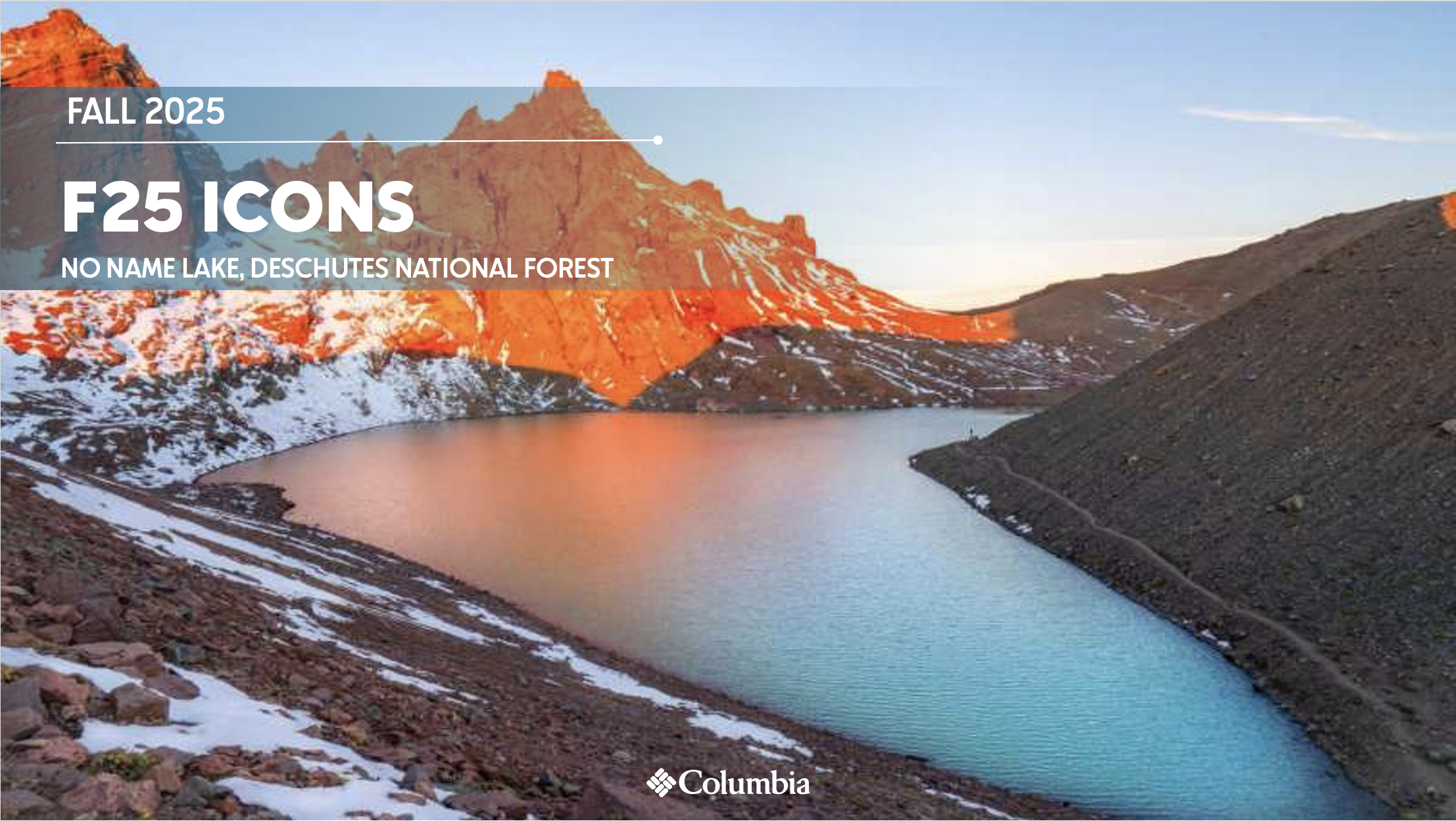
For Fall 25 the inspiration location for the greater design team was the Deschutes National Forest. At the beginning of the season, some of our design team had the opportunity to travel to Odell Lake to get inspiration and wear test some product on location. Just a few hours north, sitting atop Broken Top Mountain in the Three Sisters Wilderness, is No Name Lake, which was the inspiration for the F25 Icons collection.
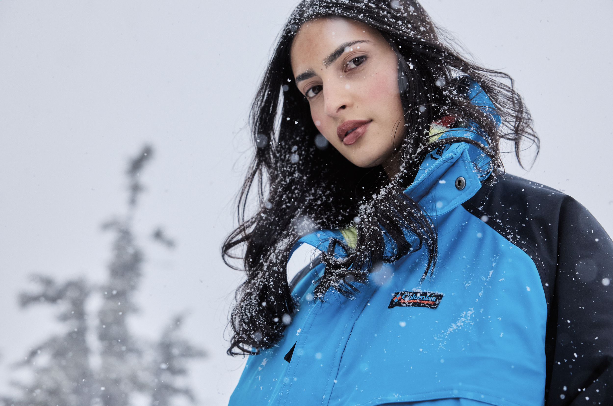
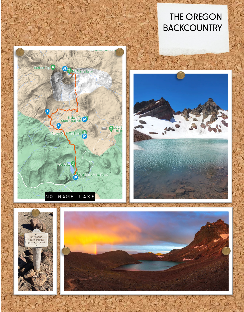
No Name Lake is a turquoise gem popping out from the surrounding black rock and snow (depending on the season). According to Oregon Glaciers Institute, No Name Lake is all that remains of East Bend Glacier, which carved out the basin where the body of water is located. The rich color of the water is caused by fine silt, or “rock flour,” that was created by the glacier’s movement across the mountain. Suspended in the water, the rock flour absorbs the shortest light waves — indigo and purple — and reflects back green and light blue.
No Name Lake is entirely glacier fed, there are no inlets. The trail curves around the edge of the lake and you can go up to a viewpoint where you will see the Three Sisters and small mountain lakes below, on the northern side of Broken Top.
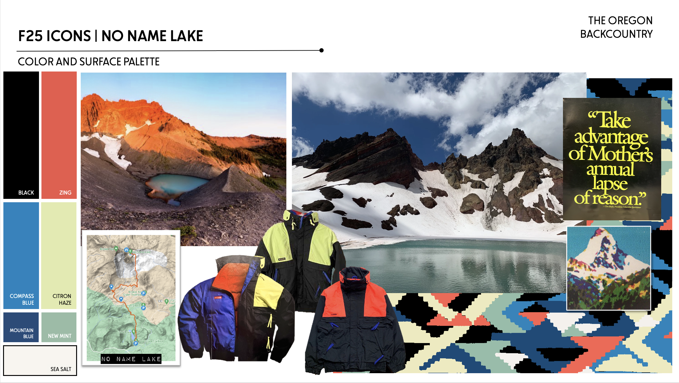
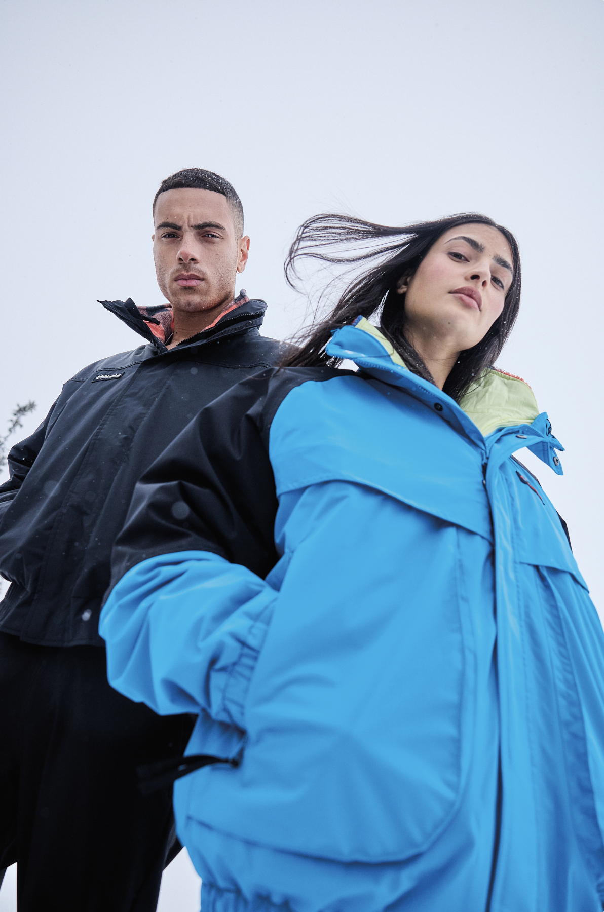
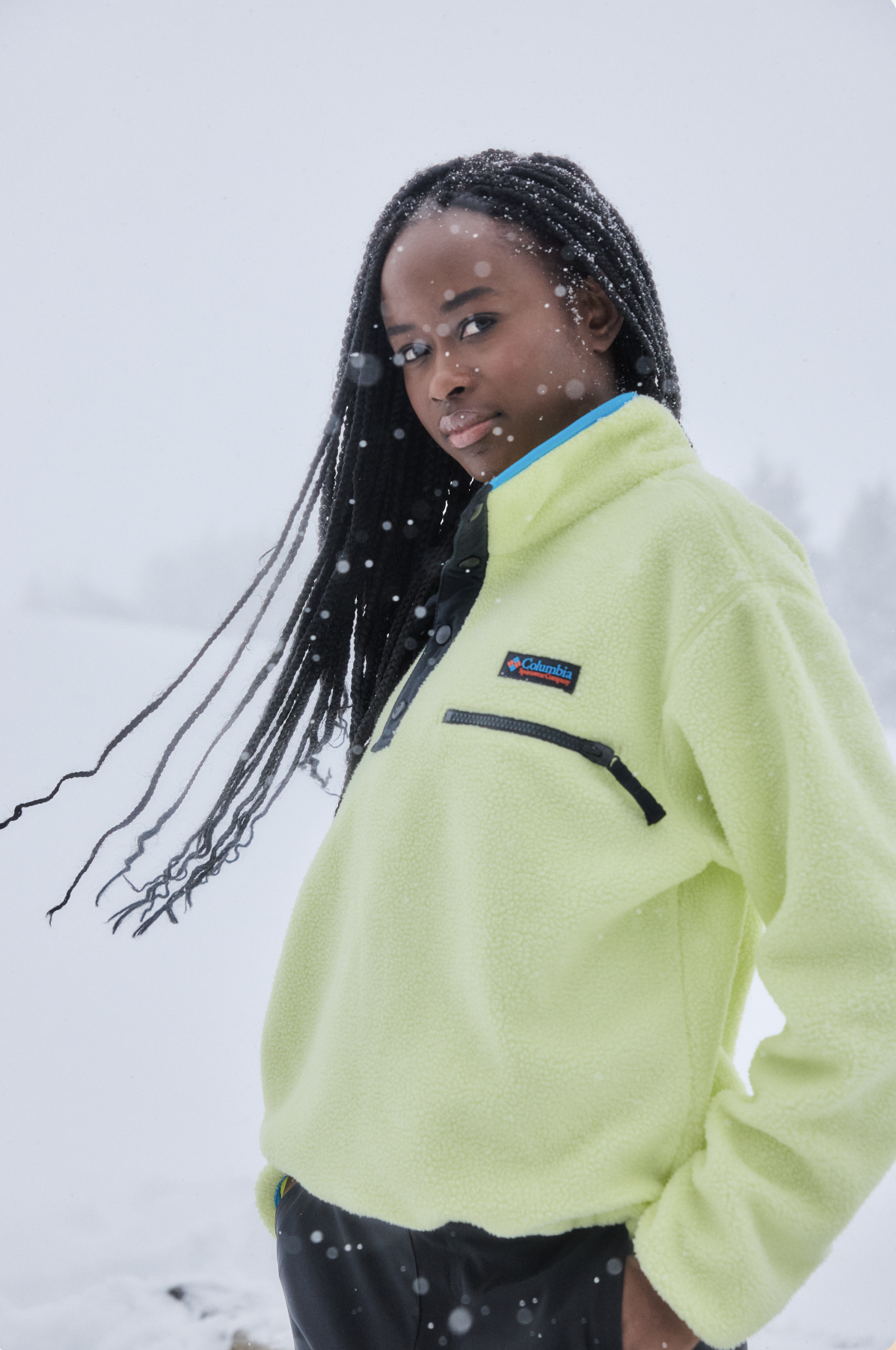
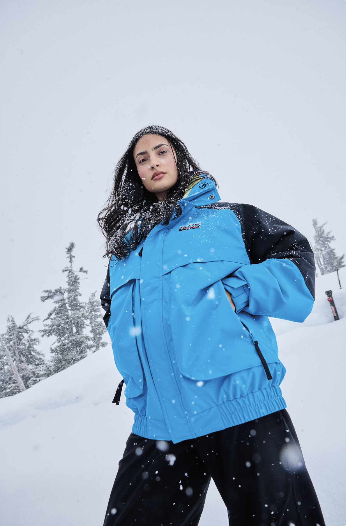
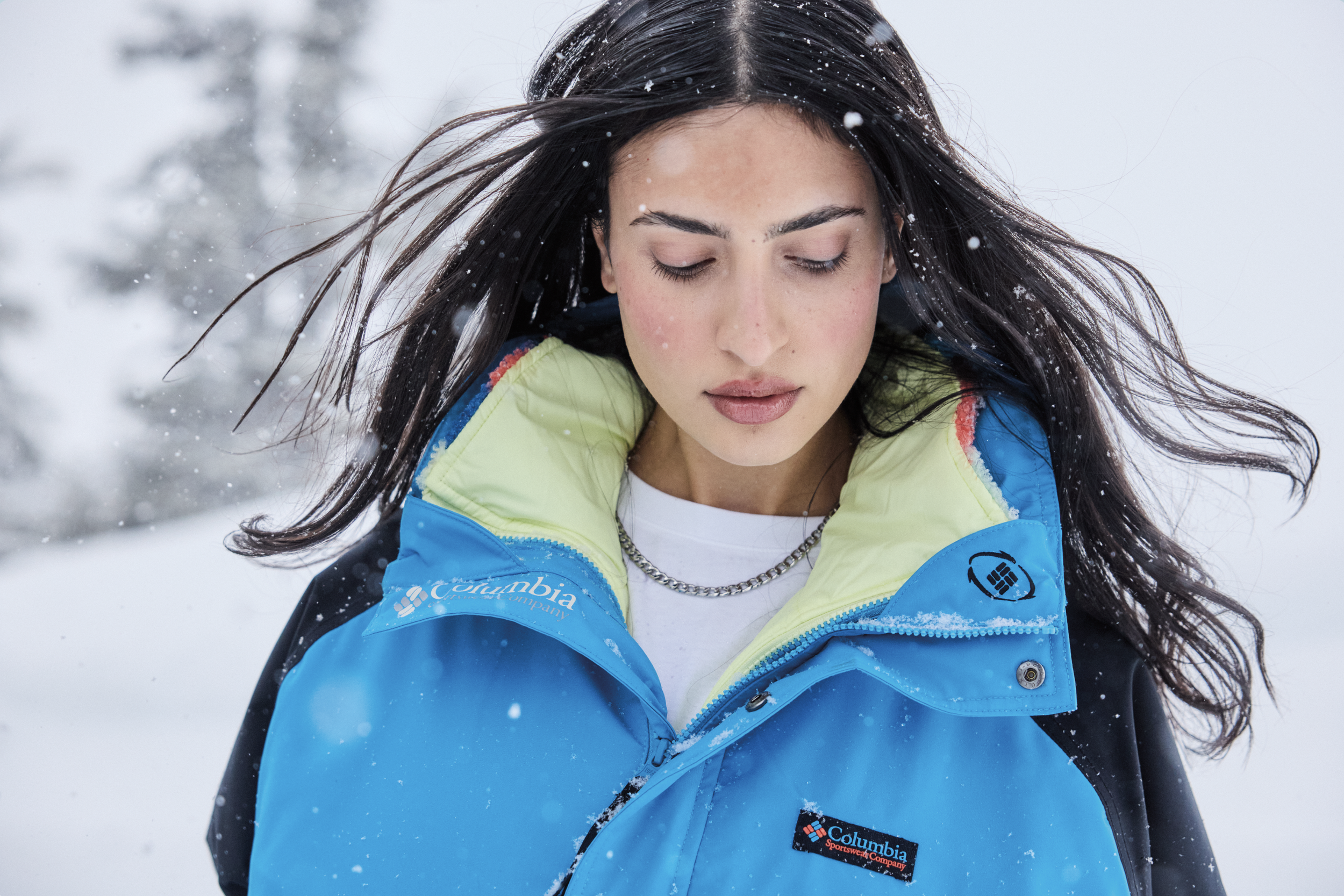
The color palette was inspired by the saturated sunset hues reflecting off the piercing teal of the lake’s water, contrasted against the surrounding black rock and snow containing it. The palette also calls back to Columbia’s history, specifically these images, pulled from our 1990 catalog.
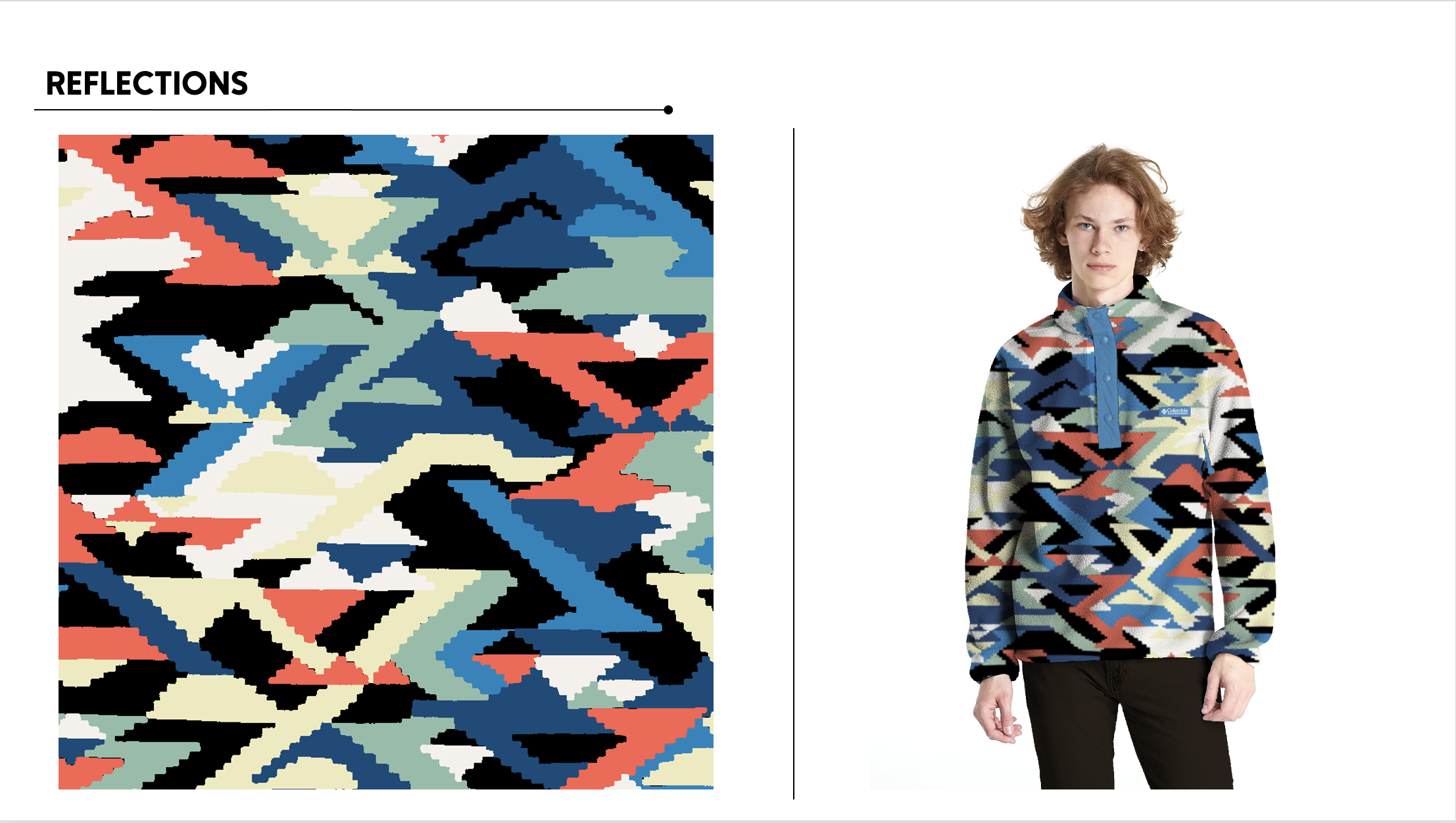
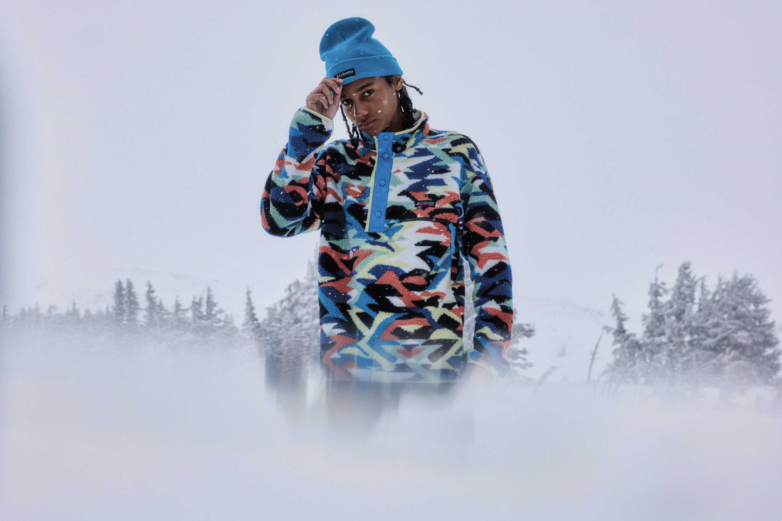
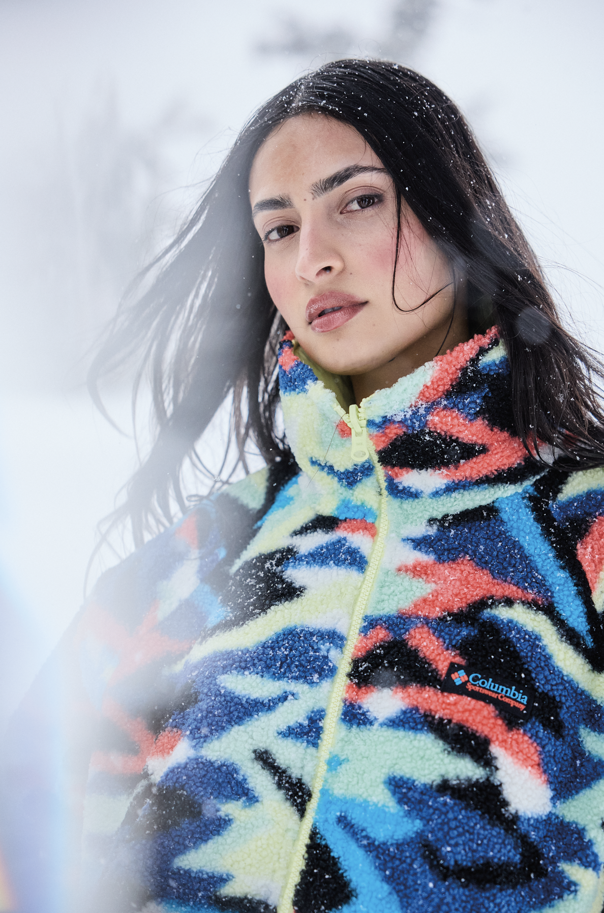
I also art directed the print for the F25 Icons collection — a large scale, macro geometric print that references the jagged peaks of Broken Top, and irregular pools of color, resembling the lake’s water. We loved the idea of bringing a geometric print back into icons as a bold statement, and because of their iconic place in Columbia’s product’s history.
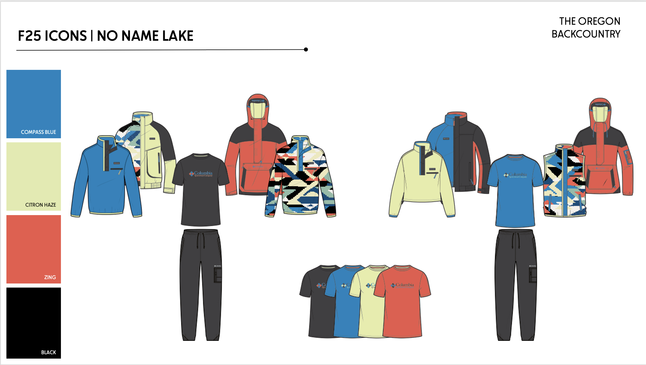
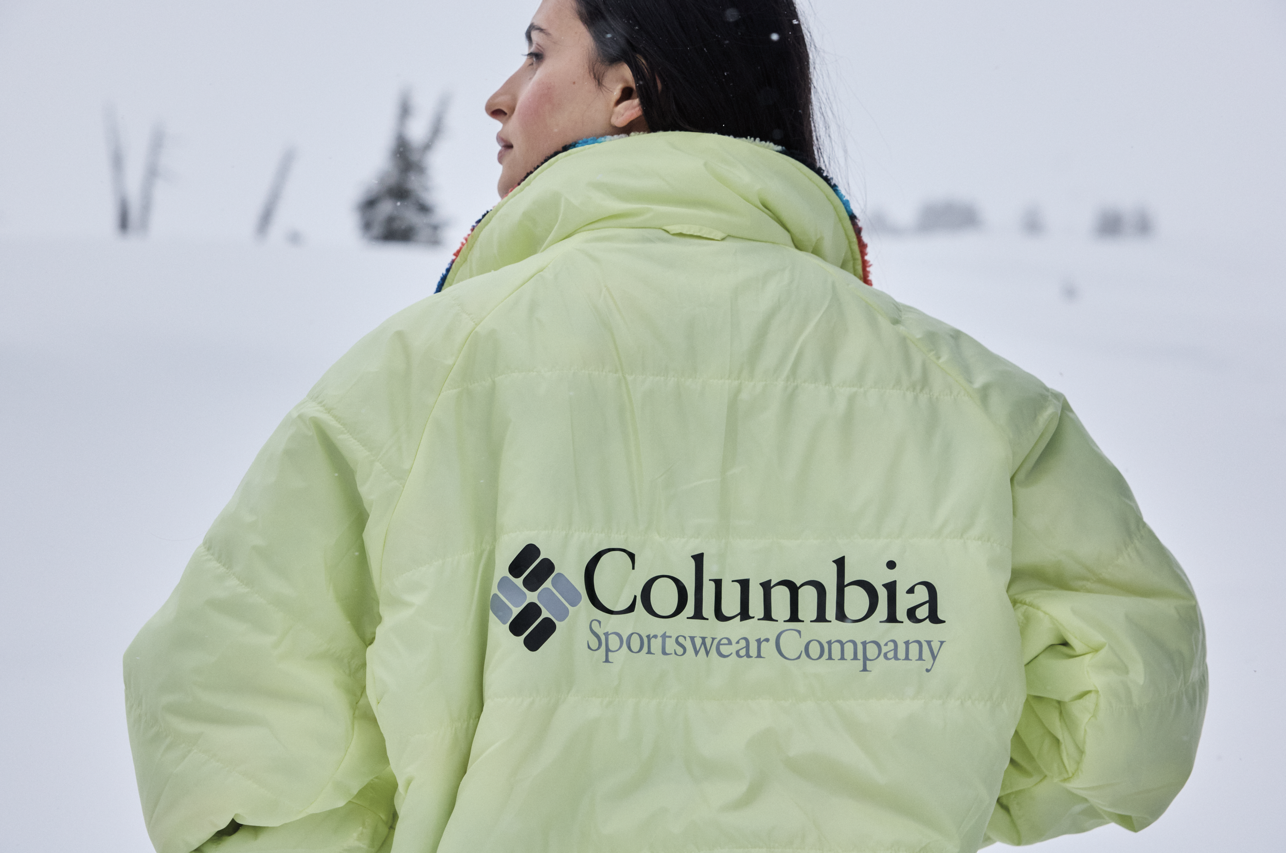
I wanted to showcase a legacy color in Icons this season, and what better color to highlight than the Brand color, Compass Blue. The other colors were all shared inline colors, but the formula and use clearly signaled a departure from the inline color stories but kept a nice link to the rest of the product assortment.